Overview
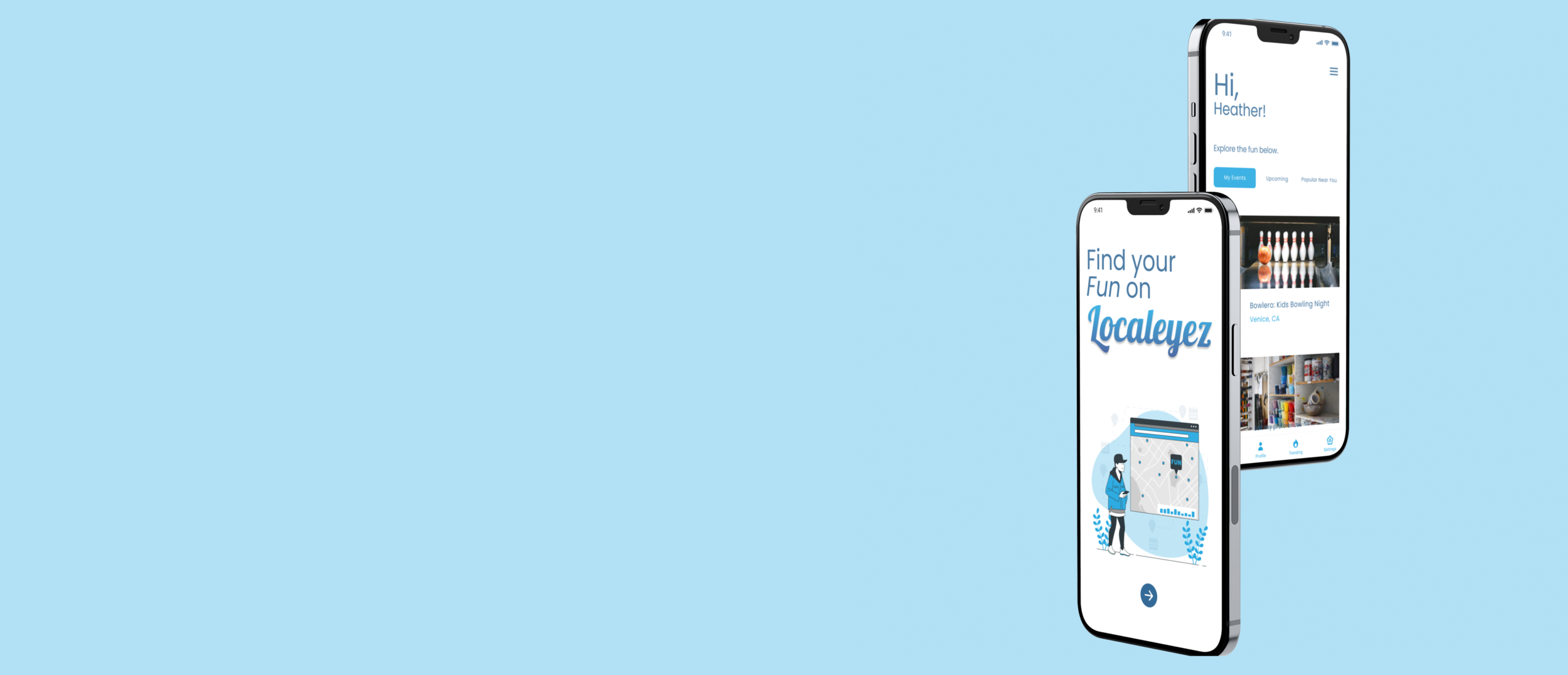
Localeyez is a local activities / experiences start up. They wanted to transition to a mobile app that uses machine learning to change the UI on a weekly basis to accommodate their users’ interests.
My role
For this project, I was collaborative with other’s deliverables. I was solely responsible for wireframing, prototyping, interaction design, testing and branding.
(If you’d like to see the deliverables I was given, click here).

Solution
I had a one week time constraint for this project and in that time, I designed an interface that follows trends, design principles and existing brand guidelines. The final solution is a high fidelity prototype that keeps user’s engaged and is aesthetically pleasing.
Audience
-
Demographics
Age: 21-50 year olds
Income: $30-120K a year
-
Attitudes
Optimistic, Social, Seeks Spontaneity
-
Interests
Food Tours, Bar Crawls, Trivia Nights, Hiking, Festivals, Block Parties, Art Walks, Sports, Nightlife, Concerts, Board Games, Family Friendly, Bowling
-
Challenges
Social Isolation due to Urban Culture, Lack of Time and Organization for Family Outings, Friends are Picky
Sketches
-
Crazy 8's

-
Ideations

Wireframes
Since I received wireframes for the existing site, I recognized important screens that would be included for mobile. These categories are “My events”, “This Week” and “Popular Locally”.
In V1 I created a wireframe that showed users their upcoming events, then “weekly” events using a horizontal scroll and under that, “events near you”. Somethings I refocused on: scope didn’t include a like, save or share feature, so in V2 we see a wireframe without these things.
Considering mental models, it is more intuitive to scroll vertically opposed to having to scroll vertically and horizontally, especially when things are related. In V2, I created a wireframe that changed the layout of events and instead of breaking off every category into one single screen, I added tabs so that events would be categorized better and easier to find.
In V1 I created two frames to show an interaction so users would receive feedback on what they just selected. I wanted to use images that related to the activity but after considering accessibility, I noted that this could use improvement. During a design critique, my team was able to help me ideate a better solution for this screen and it led me to V2.
When I worked on V2, I joined Figma’s interactive components beta and learned quickly how to create consistent variant states. I condensed two frames into one and was able to give users clear feedback of their selections without making them struggle to understand what their selection said.
Task
Open Question
“Tell us if you love it, hate it, feel confused, excited, etc-this is a safe space!”
"Using apps like this is not generally my interest, but the idea was solid. Some UI points of note: The white modal boxes on the the whit background was a bit bland. Maybe the yellow of the stars or the main blue as the background would make it pop out more.”
Tester #16431696 | October 23rd 2021, 5:40:32 pm
"Easy to use!"
Tester #52076746 | October 21st 2021, 9:21:37 am
"looks awesome"
Tester #48314933 | October 20th 2021, 3:26:08 am
"great job ! such cute animations really enjoyed that.
Tester #46712004 | October 19th 2021, 2:52:53 pm
Task
Users were asked to select their interests so the app can recommend events.
100% of testers completed this mission via the expected path.
Task
Users were asked if they enjoy the aesthetic/ design of the app
100% voted Yes on the opinion scale
What I learned
After reading the quotes from testers, it was evident that even when most people like a product, there is always room for improvement. These recommendations are taken into consideration and will be implemented in the future.
Upon further reflection…
the sizing of the text in this design was pretty small and is an important attribution to the success of the app.
A hamburger menu was unnecessary for this design since I have a navigation bar. This was redundant on my part, but it’s part of learning. I now know that there’s no need for both.
Final Thoughts
Working on this project during a 1-week sprint while balancing other projects was very challenging. It was important for me to stay within scope so that I can manage my time better. I became appreciative of Clickup for helping me stay on track with the entire process.
Through this project, I practiced prototyping interactions, created interactive components for the first time and adapted to designing with pre-existing artifacts which required a lot of studying before beginning my own process.


